 Fulldev UI
 The Astro UI library for building content sites
Components and blocks to build content-driven websites.
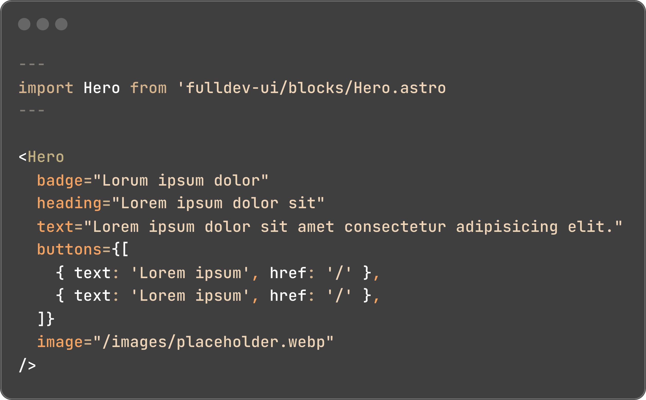
Blocks
Use pre-built blocks with just props
We created a great gallery of blocks to build content sites with a modern look and feel, all of our blocks are build with components from the library to achieve a consistent look.
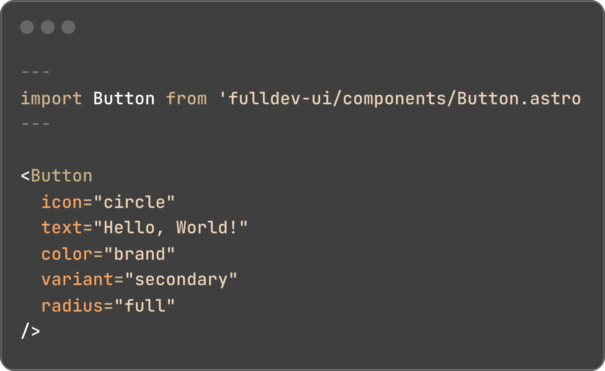
Components
Or build your own, with easy to use components
Our rich set of components make it easy to build your own blocks with great customizability through props and global theming.
Build content websites in a fraction of time
A library of components and blocks to build content sites, fast.